

Building an AI-First Design System

At Databox, we’re building an AI product that meets clients where they already work, across any environment supporting the Model Context Protocol, like ChatGPT. Instead of locking users into a single interface, we want to deliver capabilities wherever they’re needed, whether that’s inside our own product or embedded directly in tools like OpenAI’s chat interface.
Building this product meant creating UI components that could work anywhere. We wanted AI to help us build them, but that required rethinking our entire approach. AI is great at generating UI code, but most of what it produces are prototypes: rough drafts that need significant manual cleanup before they can be shipped. For AI to be truly useful, we need it to generate production-ready code we can confidently deploy.
Our frontend lives in a monorepo with applications and shared libraries built over years. We had a custom web component library with accessibility, keyboard navigation, and cross-browser support, all built from scratch. It worked well for traditional development, but the ecosystem had evolved. Modern, battle-tested component libraries offered better accessibility, stronger community support, and patterns that LLMs were already trained on. Our custom components, while functional, were essentially a black box to AI.
If we wanted AI to generate production-ready code, we needed infrastructure that LLMs could understand and extend autonomously. We needed to use tools they were already very good at. This is why we started gradually rebuilding our UI components with modern foundations that handle browser compatibility, accessibility, and edge cases by default, all following industry standards optimized for AI-assisted development. In this article, we’ll walk through the challenges we faced, the technical decisions behind our approach, and the stack we chose to make it work.
The Foundation We Needed
To transition to an AI-first workflow, we defined three core objectives that our existing setup couldn’t quite meet:
Enabling AI-native development: We wanted to leverage Claude 4.5 Opus and MCPs to automate UI development instead of relying on manual coding. Our goal was to apply LLMs where they are most effective: working with modern tools and industry-standard patterns that the global developer community had already optimized. This would ensure the AI had the best possible context to generate production-ready code.
Embraced AI-first accessibility: Rather than manually implementing ARIA attributes for every component, we wanted accessibility guaranteed by default. We needed battle-tested libraries to handle complex edge cases so that AI-generated code would be compliant out of the box.
Accelerated component development: Building a component shouldn’t have taken days. We aimed for a foundation where anyone could generate quality components quickly, using a reliable source to reference and reuse rather than reinventing solved problems.
The Solution: A Unified Design System
We realized that the only way to achieve these three goals was to establish a proper design system. Previously, designers and developers had been working toward the same goals but speaking different languages. Without shared design tokens and variables, even a simple padding change required manually revisiting and fixing components across multiple places in the codebase.
This manual process created a significant risk: Figma designs and production code could easily drift out of sync, leading to visual inconsistencies. To prevent this, we needed a system where tokens lived in one place and changes propagated automatically. This unified design system became the engine that would enable AI to generate production-ready code while maintaining perfect alignment with Figma.
The answer was a system where AI could generate components directly from Figma designs, ensuring that our code stayed perfectly in sync with our visual language. But for this to work, we needed a development environment that could move as fast as the AI itself. The reality of an AI-first workflow is that it relies on near-instant feedback loops; you cannot iterate effectively with an agent if every change triggers a long, manual waiting period. Before we could even think about automated generation, we had to fix the aging infrastructure that was throttling our speed.
The Technical Challenge: A Prerequisite for Everything Else
Our UI package was still on Webpack without hot module replacement, which meant that every code change triggered a full 45-second rebuild. We needed to migrate the UI package to Vite and fix its barrel imports throughout the entire monorepo: more than 3,000 files required changes. Honestly, we couldn’t even imagine tackling this manually, and this was also the reason why it had never been tackled before.
Our Architecture: Monorepo Ecosystem
Before diving into the changes, it helps to understand what we’re working with. Our monorepo contains three standalone applications:
Account (account management platform),
Benchmarks (public metrics comparison platform),
BFF (proxy backend),
alongside shared libraries organized into features, domains, and pages.
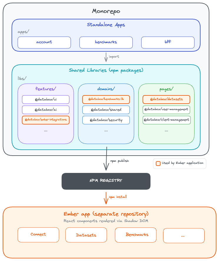
These shared packages are published to private npm registry and consumed everywhere - across our React apps, proxy server, and even our Ember application, where React components are rendered inside Shadow DOM. This architectural coupling is why performance matters so much. When our React UI library is slow or bloated, those inefficiencies ripple across the entire ecosystem. A 6.8MB bundle in our Ember integration doesn’t just slow down one app - it affects every user interaction.
Migrate to Vite & Fixing Tree-Shaking
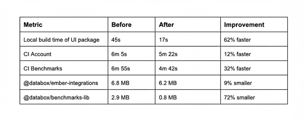
We started with the most painful bottleneck: build performance. The move from Webpack to Vite delivered immediate results. Local UI builds dropped from 45 seconds to 17 seconds, a 62% improvement. Our CI pipelines improved across the board: the Benchmarks app went from 6min 55s to 4min 42s (32% faster), and the Account app from 6min 5s to 5min 22s (12% faster).
At the same time, we tackled our barrel export problem. Previously, importing from @databox/ui pulled in the entire library, even when you only needed one component. We eliminated barrel exports entirely. Components were now imported directly: @databox/ui/components/Button/Button. The dependency graph became crystal clear, and production bundles shrank dramatically. In our Ember application, where we also embedded React components via Shadow DOM, bundle sizes dropped from 6.8MB to 6.2MB for ember-integrations and from 2.9MB to 0.8MB for benchmarks-lib, a 72% reduction that translated to the difference between a three-second load and a sub-second load for users on slower connections.
We updated the entire codebase using AI: every import path across the monorepo, every component reference, every shared library, every test case, every mock. The precision required for this work made it particularly suited for AI assistance. Where manual migration risked introducing subtle bugs through typos or missed references, AI could systematically process the entire codebase while maintaining consistency. A task estimated at 14 days of painstaking manual work was completed in a fraction of that time. The improvements were measurable across every metric: local build times, CI performance, and bundle sizes all improved substantially.
Building on Better Foundations: Shadcn and Tailwind
With build performance solved, we turned to the core design system itself. In 2026, building every UI component from scratch no longer makes sense. The ecosystem has matured: battle-tested, accessible, well-maintained libraries exist for nearly every common pattern, backed by strong and responsive communities.
We chose Shadcn UI with Tailwind CSS v4 as our foundation. Shadcn isn’t a traditional component library you install from npm. Instead, it’s a collection of reusable components that you copy into your project and own completely. This gave us full control over implementation while building on solid foundations. Under the hood, Shadcn is built on Radix UI primitives, which provide headless, fully accessible components with proper keyboard navigation, ARIA attributes, focus management, and screen reader support. Everything is WAI-ARIA compliant out of the box. We simply applied our own design tokens on top.
Switching to Tailwind solved our runtime CSS-in-JS overhead. With Styled Components, styles were processed at runtime, adding JavaScript overhead. Tailwind generates styles at build time instead. Its atomic CSS approach, combined with JIT compilation, ensures that only the utility classes actually used in our code make it into production, leading to smaller and more predictable bundles.
But there’s another crucial reason why we chose Tailwind: it works exceptionally well with large language models. Tailwind’s utility classes form a finite, well-documented vocabulary that LLMs can learn and apply consistently. Because styles live inline with markup, AI has full context in one place when generating components. The result is leaner, more readable code. AI generates components that are ready to review and ship, not rough drafts requiring extensive cleanup.
Every new component came with Storybook stories, so designers and product managers could see exactly how components looked and behaved in real time. This shared visibility kept everyone aligned and sped up feedback loops considerably.
Where We Are Now
Today, we’re running two component systems in parallel. The old system remains untouched while all new components are built with Tailwind. We’re gradually migrating old components over time. We used a tw: class name prefix to prevent style collisions between the two systems.
Connecting Design and Code with MCP and Design Tokens
With fast builds and a maintainable component foundation in place, we tackled the final piece: eliminating manual Figma-to-code translation. We integrated several MCP (Model Context Protocol) servers into our workflow to bridge the gap between tools.
The Figma MCP server read design tokens and components directly from Figma files, eliminating manual translation. When a designer defined colors, spacing, or typography as Figma Variables, we could extract them programmatically and generate corresponding code. The Shadcn MCP server enabled rapid component scaffolding. AI generated new components while respecting our architectural decisions documented in CLAUDE.md files, ensuring consistency when porting components from our old system to the new one. The Asana MCP server kept the migration on track, giving the team visibility into progress across dozens of components and tasks.
The workflow now looked like this: designers defined tokens as Figma Variables, which we exported to CSS Variables and mapped to our Tailwind config. One shared language across design and code. A designer could change the primary button radius from 8px to 6px in Figma, and within seconds, AI could generate the corresponding code update with the new token value. No manual copying, no human translation errors, no drift between design and implementation.
The result was our v2 component library, a fresh foundation built on Shadcn and Tailwind, living alongside our existing components during the transition.
Designers and developers finally spoke the same language.
What Comes Next
The next evolution is already underway: full automation of the token sync pipeline. When a designer updates a token in Figma, a webhook will trigger GitHub Actions that extract the change, write it to our Tailwind config, and build a new version of our ui-design package. The consuming repositories will then receive an automated pull request with the installed and updated versions. Designers will be able to preview the changes in Storybook to verify everything looks right before shipping. Zero manual steps from Figma to code.
Conclusion
Building a design system in 2026 looks fundamentally different than it did a few years ago. With Tailwind, Shadcn, MCP integrations, and AI-assisted workflows, we’ve turned what used to require a dedicated team and weeks of manual work into something a small team can accomplish quickly. The key was choosing the right tools - ones where LLMs excel and community support is strong - then defining our own architectural patterns and being strong reviewers. With the automated token sync pipeline coming next, designers will update a token in Figma and see it live in production minutes later. The setup works. We’re faster and more efficient. And we’re just getting started.